Contents
- 1 #1 Muted Colors
- 2 #2 Asymmetry
- 3 #3 Data Visualization
- 4 #4 Accessible Designs
- 5 #5 Minimalism
- 6 #6 Flat Icons and Illustrations
- 7 #7 Classic Fonts and Vintage Effects
- 8 #8 Motion Logos
- 9 #9 Social Slide Decks
- 10 #10 Overlapping Designs
- 11 #11 Geometric Shapes
- 12 #12 Dark Mode
- 13 #13 Gradients
- 14 #14 Text Videos
- 15 #15 Authenticity
- 16 Final Verdict
That is why, it has become evident for businessmen to hire such an agency that provides professional services of graphic design in Raleigh NC in order to extend the reach of your brand because the world of graphic design is an ever-changing field, however, trends can replace each other year after year.
#1 Muted Colors
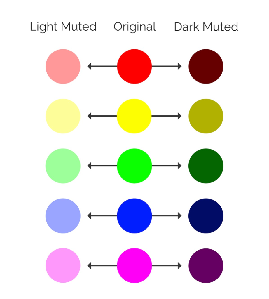
The times when neon colors were grabbing all the public love and attention have passed, giving the place on a pedestal for muted, pastel colors or black-and-white color solutions. The design in a way to highlight the content. The color palette doesn’t change, what does change is the sharpness. You can incorporate as many colors as you want but there are several combinations that look most attractive. These are the following:
- Black and white. (Used as a basis of the majority of Apple pages. Thus, you may well expect to be accused of plagiarism).
- sea blue and mint;
- mustard and beige;
- black and lime;
- pink and secret moss;
- black and red scarlet;
- soft green and white.

#2 Asymmetry
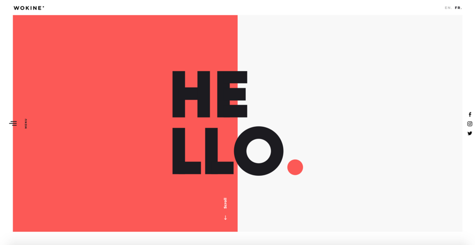
Grids and strict straight lines are going out of design tendencies. Instead, designers tend to use asymmetry in brand design and logos. Asymmetric designs are outstanding and memorable. The tendency for asymmetry allows designers to add creativity to muted colors and the pure minimalism of the site making it recognizable and accentuating the shape rather than bold color. Moreover, the designers are given more space for creativity. Not following the grid format allows them to move elements around and create more white space.
#3 Data Visualization
Big Data is a new section of innovation. Each sphere is so strongly oversaturated with information that a simple transmission in numbers or images is no longer possible. More and more companies pay attention to data availability encouraging potential customers to become real customers. The exchange of raw data is of little value to the viewer. Nobody wants to look at a bunch of numbers. You need to make it visually appealing and easy to absorb. In 2021, people will be drawn to simple visualizations.
#4 Accessible Designs
Following trends is an easy way to promote your brand and keep it in demand with the flow of time. Keep in mind that designers not only have to be aware of what is the hottest trend but also how to make the design accessible. Accessibility is no longer a caprice concept of a brand. This a way to cover a wider audience than previously found your material hard to get and make your content more socially conscious.
#5 Minimalism
It’s excellent if this sounds obvious to you. It means your brand looks up-to-date and can confidently march to the future. Minimalism has penetrated every part of modern life including home design, gadgets, advertising banners, and clothes. There was a significant shift into minimalism over the last years and this tendency continues to grow in 2021. The more customers will view your brand site’s content on mobile screens, the stronger the trend for minimalism is going to become.

#6 Flat Icons and Illustrations
When developing a website design, designers often use stock images and photos. If your brand is already prospering on the market, then keep it up and skip this paragraph. The user is used to your style. If you’re starting a new project or planning to rebrand the old one radically, then pay more attention to simple, drawn illustrations rather than to 3D aesthetics. The flat look is a real trend in 2021. First, you can add more diversity. Second, you will make a customer love a product. The thing is, viewers will more likely to address stock images to already existing brands while the newly-created may be stigmatized for lack of creativity.
#7 Classic Fonts and Vintage Effects
Classic fonts as well as vintage trends are making a comeback. Clothes, vitrines, street brands are all under the influence of the trends of the past. This will definitely be a trend in brand design in 2021. Immerse a viewer into the decades of the 1990x, evoke nostalgia, elegance, and reliability. The world and graphic designers can use some of these qualities right now. No need to use these fonts in large paragraphs, headings and subheadings will be enough.
#8 Motion Logos
What is all brand design about? Why do companies pay so much attention and costs for developing a unique image of their brand? Have you ever thought about that? The thing is, the design and appealing picture are the factors that will make a user remain on the same page or post for a long time. The longer they look at the post, the more likely, they will interact with a brand. Same with the brand logo. This is an integral part of the brand’s identity. This is how people recognize the brand. Apple, Starbucks, McDonald’s, Microsoft, and Google are all recognized everywhere on the globe. Motion logos are a way to add modernity to your logo and make it look presentable in the upcoming year.
#9 Social Slide Decks
Social slide decks are created to be shared on social media and spread brand awareness. They are mainly used in Insta and Linkedin because of the way these platforms handle the pictures. In addition, the algorithms on Instagram and LinkedIn seem to be promoting these slide decks far better than a single image. Zoom company has been sharing slide decks on its Instagram account and getting plenty of views as a result.
#10 Overlapping Designs
Overlaps are going to take place in 2021 design for several reasons. First, they add more depth to the image. Second, overlaps help designers to group more elements on a page and still leave much blank space on it. Third, they help to create associations between elements because of their proximity to each other. The proper use of overlaps and overlays makes the content more effective.
#11 Geometric Shapes
The 2020 and 2021 in an Epoque of prevailing minimalism. 2019 brought us flowing “liquid” shapes that weren’t easy to recreate. Thus, the following year is proclaimed to be the year of geometric shapes that are easier to create and establish consistency across a brand’s visual content.
#12 Dark Mode
Dark mode has gained popularity during this year and it’s not going to fade in 2021 and even beyond. Apps, social networks, and operating systems say yes to dark mode options for their user-interface. It’s a sleek and stylish look that accentuates design elements and helps to reduce the eye load. Apps like Twitter, YouTube, and Insta have already adopted this trend and for 2021 a dark mode will be a must.
#13 Gradients
Designers recognize hundreds of shades for every color. Every year such variation is used more and more active when creating a more attractive product design. Gradients have been a trend in graphic design for the past three years. As polls and expert comments show, so far no one intends to forget this trend.
Why are gradients so popular? First, they provide more room for creativity. Second, the user is ambiguous. Third, the gradient creates a sense of movement which is analogous to motion design, but without animation.
#14 Text Videos
Text videos are something that can’t be ignored. Why? Because of the pandemic and the changes it brought in the way we work, create, and perceive content. Remote work has become the norm and so it will be in 2021. Sure, producing video content is much harder but it’s the way to attract billions of viewers daily.
#15 Authenticity
Every year there is more and more talk about pretense in advertising. The user sees the acting and simply does not believe everything that is shown to him. Therefore, when creating your brand and product, think about transparency and simplicity. Pay more attention to real conditions and natural colors. Use all the elements that can be in harmony with nature. After all, nature is the best association of pure and sincere design. No need to deny that authority will become a focus for many companies’ 2021 brand strategy. In order to stand out from a huge number of websites, including all kinds of blogs, dating, news, esports sites, you need to find your own voice.
Final Verdict
Graphic design provides benefits that go beyond the visual comprehension of the brand. In the fast-flowing world, it’s essential that a graphic designer is acquainted with the latest trends of the sphere they’re working in. Having read this article, you’re now aware of what changes will come in 2021 and why it’s so important to adopt them.

