Contents
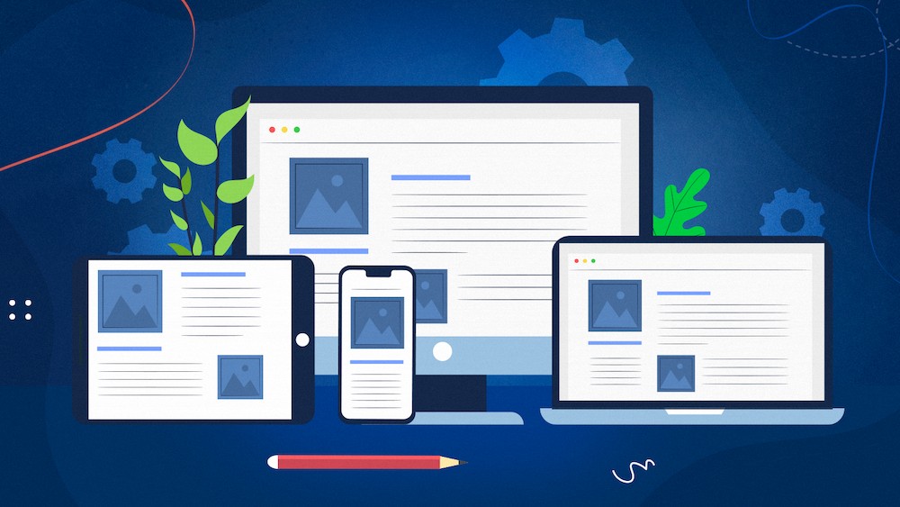
Responsive web design is something that can simplify the life of any web product owner. After all, it solves the pressing problem of correctly displaying a resource on any device (no matter if your users use a tablet, smartphone, or computer). However, to understand its basic principles and how it differs from the adaptive design is very difficult. Especially without the help of a professional. That’s why we leave a link to an experienced team for responsive design which will not only explain the principles of this type of design, but also help to create it. We, in turn, will try to briefly go through its basic principles and tell you how it differs from adaptive design.
Two concepts: responsive and adaptive web design. What is the difference?
The development of technology, the global crisis caused by the pandemic has tightly hooked people on the use of gadgets. Today, almost everything can be solved through the Internet, from buying shaving foam or potatoes, to making deals and documents. Thus, a person uses different gadgets for different needs. Some tasks require maximum mobility and speed, while others require a bigger screen. The fact that site owners constantly have to adapt to the needs of users remains unchanged. In today’s world, there are two most popular approaches for creating websites that adapt to different gadgets:
Responsive web design, where sites have specific property values (such as a flexible layout grid that allows you to create one layout for all devices).
Adaptive web design (aka dynamic display) involves designing a site with existing conditions that can change depending on which device the resource is viewed. This is possible due to the presence of multiple layouts of a fixed width.
The basic principles of responsive web design
This concept was introduced by Ethan Marcotte back in 2011. That is, this approach is not something completely new. Which means that its application already has many principles and proven approaches. The main advantage of this type of design – a moving grid, thanks to which the layout of the site can automatically respond to changes in screen size. Responsive design stands on three pillars of methodology:
- Using a flexible layout (the basis for it is a grid).
- The use of flexible images.
- The use of media queries.
In turn, the first method implies the introduction of relative units of measurement instead of the standard pixel units. This is so that page width can be adjusted based on space. So what happens to the text? How to achieve the correct display. There’s actually a pretty simple principle: it’s really all about calculating the size of the font in relation to the browser default font size. Then we move on to images. In order to make them flexible, the designers came up with a special rule, which is used for all images on the site (it’s about img {width: 100%; max-width: 100%;}). To decipher this abracadabra let us explain the meaning: the use of this rule means that the image does not become wider than the space in which it was placed and will not exceed its size when displayed on the big screen. It remains to understand what media queries are and why they are needed. So, their task is to change styles depending on the characteristics of the device associated with the display of content. The list of characteristics includes the type, width, height, orientation and resolution of the screen. Thanks to the media queries and getting a responsive web design, it applies the necessary styles for any screen size to display correctly.
Techniques of responsive web design
So, having discussed the basics, you can briefly go over the additional techniques that are used in successful responsive design.
- In order to avoid the image quality loss due to changes in scale it uses svg images.
- There is a trick to work with content related to the use of card interfaces. They are rectangular and have slightly rounded edges and are a great place for content. In addition, they are easy enough to move around the layout.
- Another technique of responsive web design is to practice the rules of minimalism. In this case, the best work is simple, but stylish layouts.
- In order to achieve the convenience and not to clutter the space in this form of design are used by hidden controls, pop-up windows and so on. Thus, what the user sees is easy to use and pleasing to the eye.
- In creating a responsive design, they also use a large clickable space for the buttons. This makes them more visible and easy to hit.
- One last thing worth mentioning is the introduction of interactivity. For example, it’s fun to have an animated picture appear in front of you after you click on a functional button.