Contents
Although SaaS products have become commonplace in modern business, some people still struggle to use these platforms. For the most part, this has to do with developers and their policies. While most SaaS are optimized for perfect user experience, there are those that feel clunky and unintuitive.
So, if you wish to improve the perception of your SaaS, you’ll need to simplify its use and make it available to the widest range of users. In this article, we talk about seven best practices that will boost user experience and, thus, user satisfaction.
1. Hasten log-in process
Trials are a common lead generation strategy within the SaaS field. By giving users a chance to test your solution, you can significantly ramp up your sales numbers. Unfortunately, many brands fail at this initial step, which is why it’s often better to pay for elite SaaS application development services than doing things in-house.
The most common mistake is using complicated access. You need to ensure that the website visitors’ first experience with the company is positive, as it will set the table for everything else. Here are a few tricks you need to use for signups:
- Provide different but quick signups. Let them access the software via email or Google login
- Avoid collection of data and newsletters. If people like the tool, they’ll buy it
- Track engagement with a sign-up form. Figure out where’s the biggest drop-off and try to remedy the issue
2. Improve onboarding
The most popular SaaS are usually those that have seamless onboarding experience. These tools are meant to provide simple and straightforward access to all users, regardless of their tech skills. Among others, you should quickly demonstrate how a person can gain value by using your solution.
These are the three best tricks for improving the SaaS onboarding process:
- Create explainer videos on your homepage. Showcase the most important features and take screenshots
- Whenever possible, customize the experience so that it’s better suited for a specific user
- Create product tours so that users can be quickly introduced to new workflows
3. Optimize dashboard
When a person first opens the application, they’ll be sent to the main dashboard. During this step, it’s imperative that you leave a positive impression by focusing on the right information. Ideally, you need to showcase the most important information while making everything else accessible via menus.
Depending on the type of SaaS, most users will just need access to a few basic features. This is especially true for analytical software, which prioritizes several KPIs. So, make sure that this information is visible while pushing other buttons and elements to the side. Here are a few secret techniques that can help you out:
- Allow users to change the data format. Give them the option to put data into chats, clump them together, or hide unwanted data
- Simplify the phrasing and use the same terminology throughout the tool. Avoid using acronyms when possible
- Make sure that the elements are big enough but not overwhelming
- Pay attention to how you’re using colors
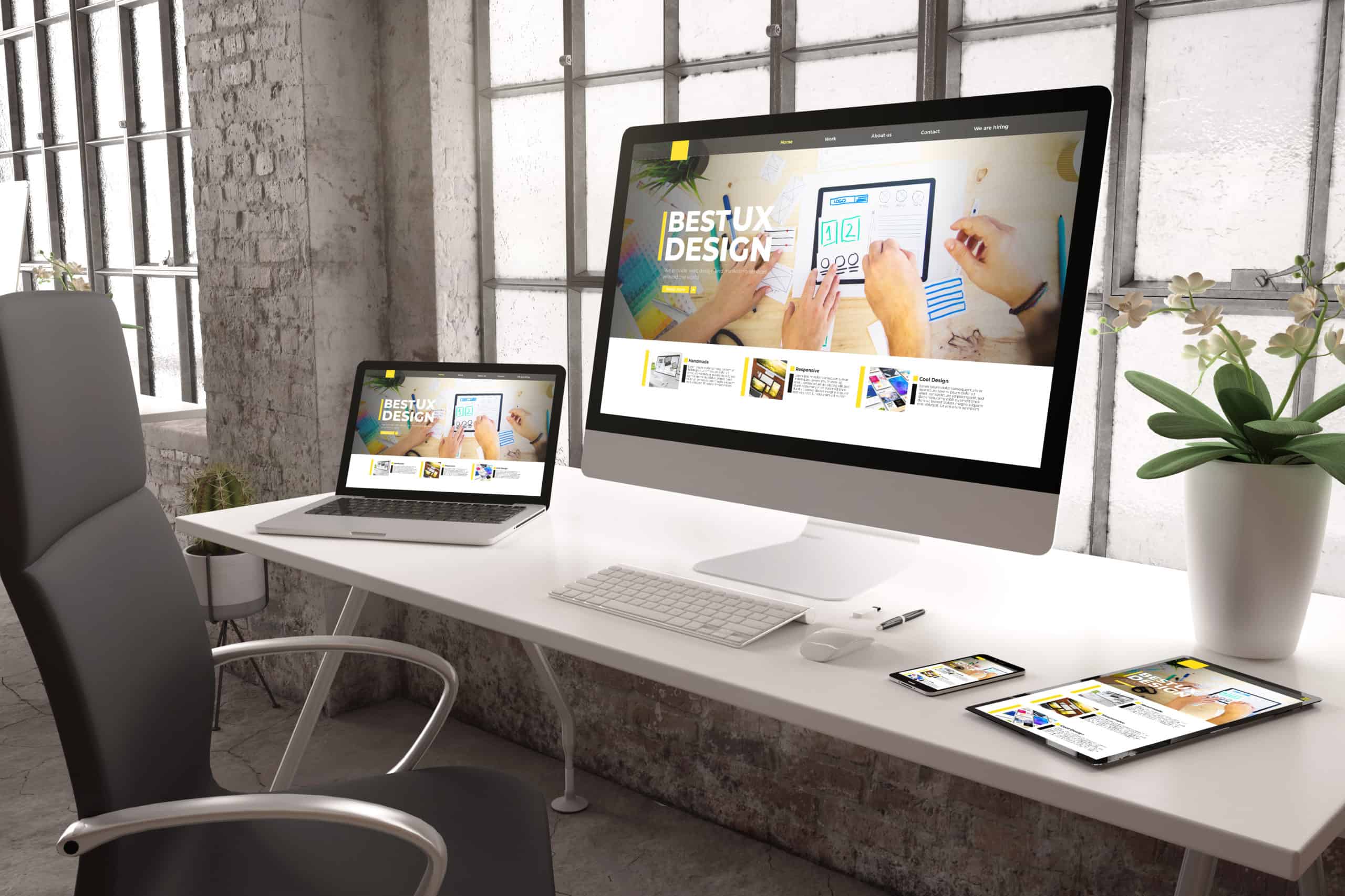
4. Design for different devices
Most companies create solutions that are well-optimized for desktops. Unfortunately, the fast, modern living forces us to often access data via phones and tablets, which offer significantly less working space. While you can’t accommodate the same experience for mobile users as those on desktops, you need to make the gap as small as possible.
Specifically, you should try to implement the following practices:
- Spend some money on a professional that is well-acquainted with multi-device testing. Make sure that that person checks UX on different devices
- If you have limited resources, you’ll need to assess the business ramifications of creating a mobile version
- Prioritize important, frequently used features
Like other parts of your SaaS, the navigation bar needs to be intuitive. This element is especially important for tools that have numerous features and have mobile versions. You need to pay attention to various potential issues such as wrong redirects, unclickable sections, or messy interface.
These are the main considerations when designing the bar:
- Your navigation bar should be noticeably different from other elements to attract users’ attention
- Never hide your bar, as many users won’t even know it’s there, effectively preventing them from using it
- Create a good sitemap that can serve as a basic layout
- Add a search box to the navigation bar. Having an internal search is especially important for complex tools with lots of data
Footers are one of the most overlooked parts of the design when we’re talking about SaaS platforms. For many people, they are the last-ditch effort to find certain information that isn’t available on other menus.
While footers usually consist of secondary information that isn’t frequently used, they might still include certain data that you can’t find elsewhere. Make sure to put some effort into creating your footer so that the users won’t miss some vital information, such as policies or contact.
These are the main tricks you should use when creating a footer:
- People expect that the footer has all sorts of legal information, contact data, and About Us. Make it easier to interact with your company and software by adding all these sections to your footer
- If you’re adding social links to the footer, make sure they’re frequently used. Otherwise, you might alienate your users
- Provide additional touchpoints with your company that would allow users to contact you from the tool page
Ensure that your buttons can be clicked. The last thing you need is to make users mad by preventing them from accessing certain data. While these bugs aren’t that hard to address, they can have a brutal impact on user experience. So, to prevent potential issues, make sure to use the following tricks:
- Allow users to share their feedback about different types of bugs, including unclickable buttons
- Make sure to check the buttons for the main features first
If possible, provide extra information about the link destination and what does the button do